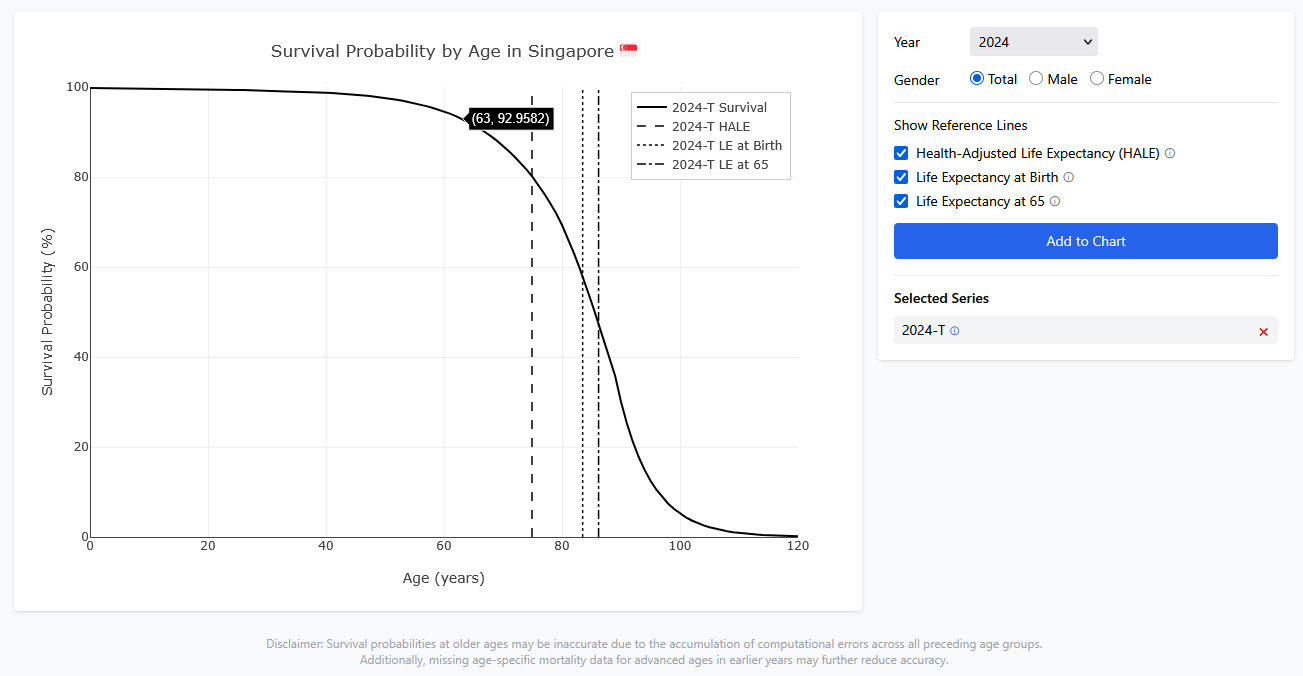
Sometimes, data is abundant but visualisation and insights extraction are issues. For example, most people would know the life expectancy for citizens of their country, but information about the standard deviation of an average life is scare. It makes a difference for life planning if the life expectancy of an average life is 83.5±1 vs 83.5±20. The former would bring about less uncertainties to life, while the latter turns life into a capricious voyage with unpredictable ends.
One way to visualise the standard deviation of the life expectancy would be plot the survival probability of an average life. This can be calculated from the mortality rates. Here is an interactive tool to visualise the data.